Question: Can you recommend a tool that provides interactive visualizations for exploring and comparing demographic and economic data across different regions?
Data Commons
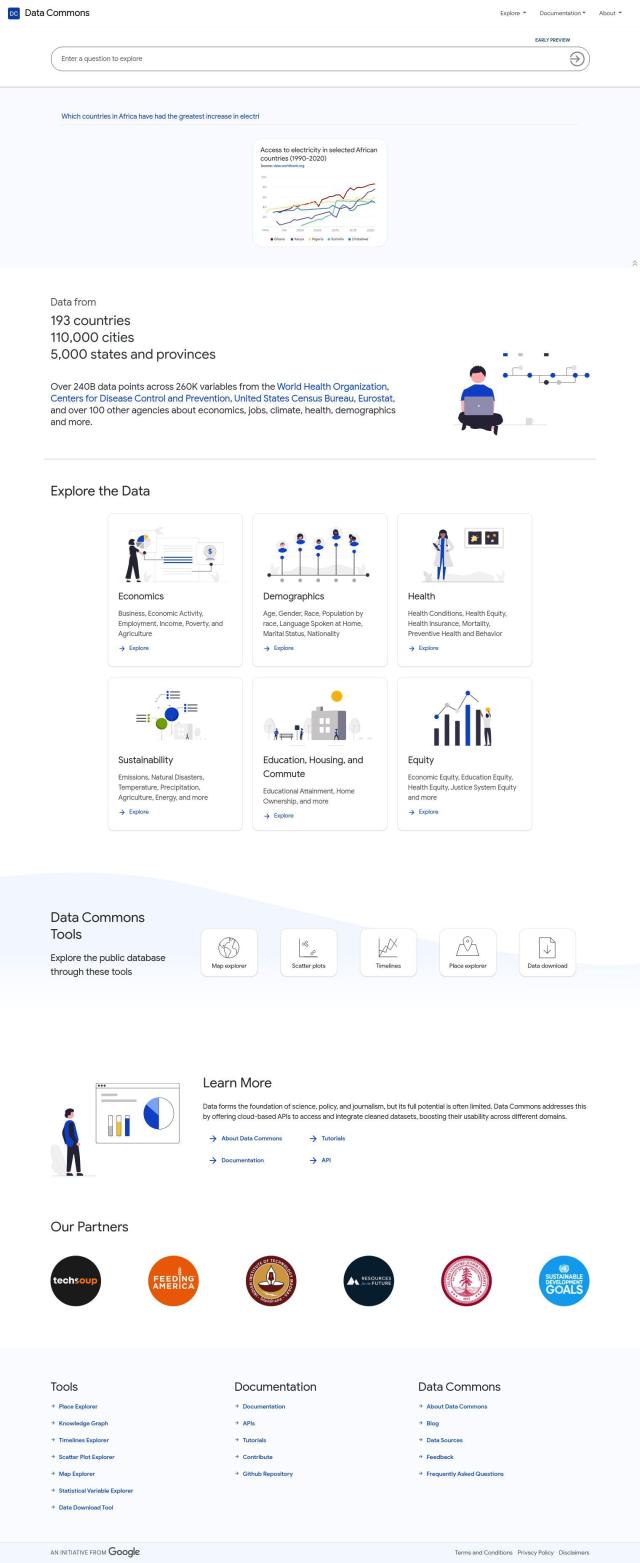
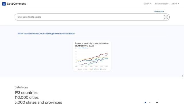
For interactive visualizations to explore and compare demographic and economic data across different regions, Data Commons is a comprehensive public repository that aggregates and indexes data from over 193 countries, 110,000 cities, and 5,000 states and provinces. It offers features like a map explorer, scatter plots, timelines, and a place explorer, providing detailed demographic, economic, and educational data for specific locations. The platform can be integrated with other tools like the Knowledge Graph and Timelines Explorer for extensive data visualization and analysis.

Tableau
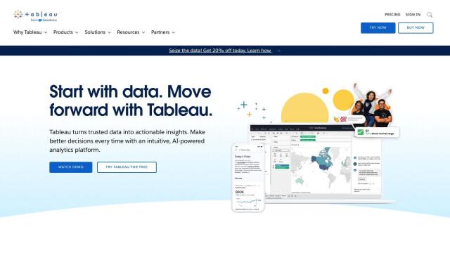
Another excellent option is Tableau, a business intelligence and analytics platform that allows users to create visualizations through a drag-and-drop interface. Tableau can connect to a wide range of databases and offers various deployment options, including cloud and on-premises. Its features support visual storytelling, collaboration, and governance, making it ideal for creating interactive and shareable visualizations for business insights and decision-making.

CARTO
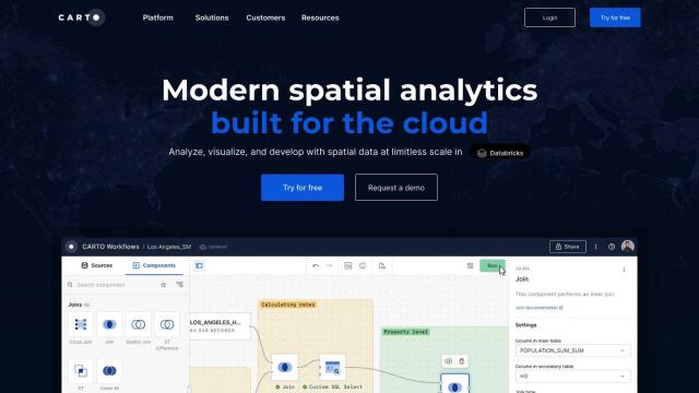
CARTO is a cloud-native location intelligence platform that enables users to analyze and visualize spatial data at scale. With an intuitive drag-and-drop interface and over 100 pre-built analysis components, CARTO supports rich data visualization and secure publishing of insights. The platform is compatible with leading cloud platforms, offering a robust solution for businesses looking to leverage spatial analytics for strategic decision-making.

Onvo
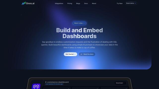
For those interested in AI-powered data visualization, Onvo provides an interactive platform that simplifies the process of creating charts and dashboards without writing complex queries. Onvo supports connections to multiple data sources and offers customizable dashboards and personalized analysis, making it a great choice for both startups and enterprises looking to streamline their data visualization workflows.

