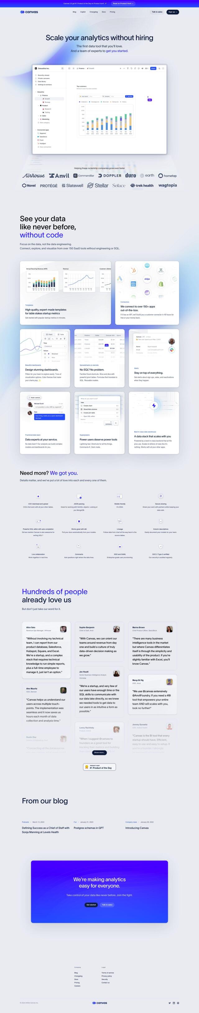
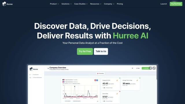
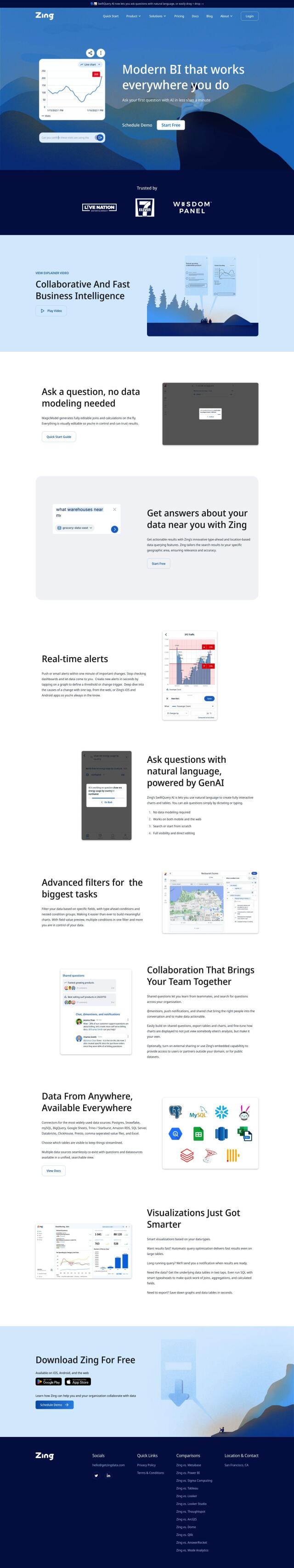
Question: Can you recommend a data visualization tool that easily connects to multiple data sources and provides customizable dashboards?
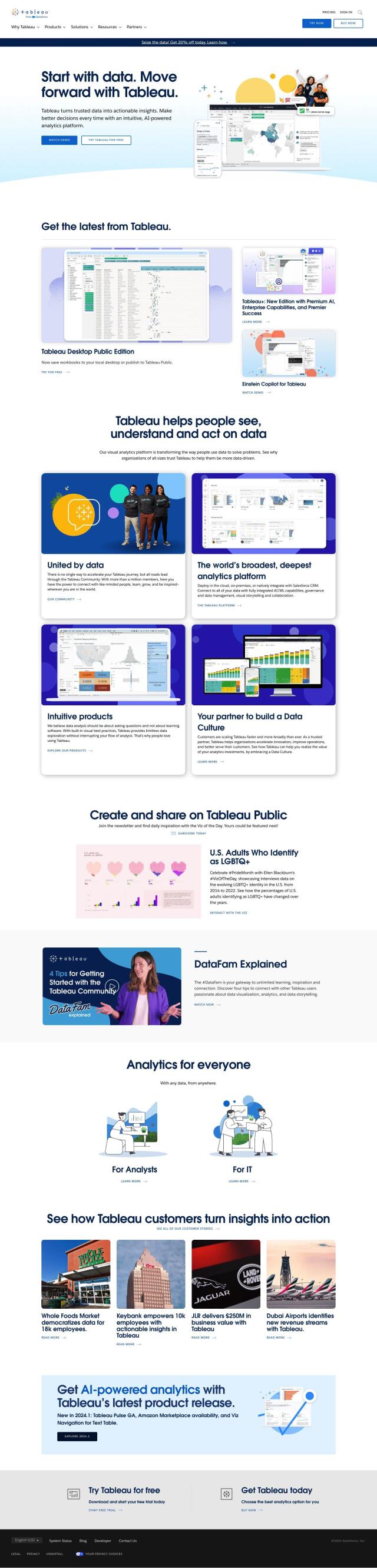
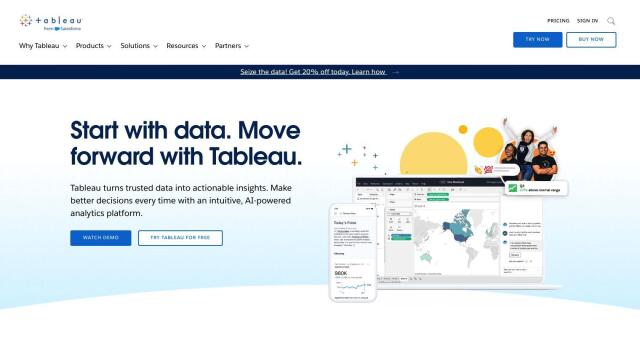
Tableau screenshot thumbnail

Tableau

If you're looking for a powerful data visualization tool that can connect to many data sources and offer customizable dashboards, Tableau is a top pick. It can connect to a variety of databases and has drag-and-drop interfaces for creating visualizations, so it's good for people with varying levels of technical expertise. Tableau also offers cloud, on-premises and Salesforce CRM deployment options, as well as features like AI/ML, governance and data management.
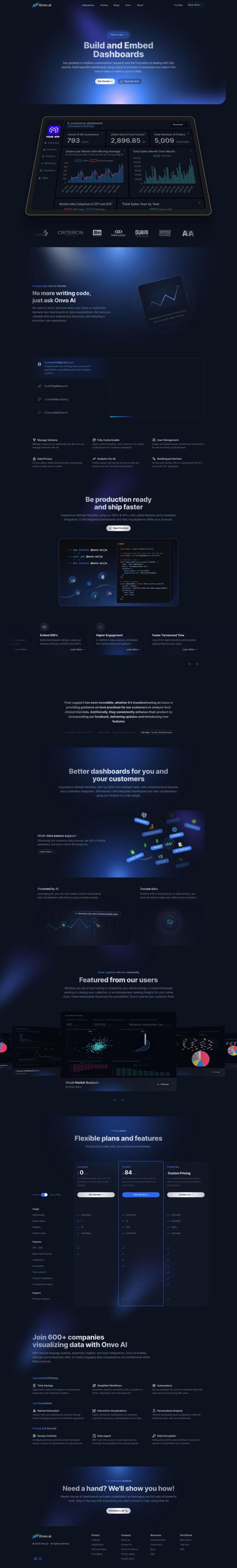
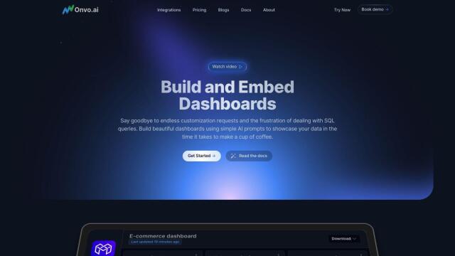
Onvo screenshot thumbnail

Onvo

Another strong contender is Onvo, an AI-infused data visualization tool that uses AI prompts to make it easier to create dashboards. Onvo lets you connect to a variety of data sources, including MongoDB, PostgreSQL and Google Sheets, and customize dashboards so they match your brand. Its automated features can make it easier to create interactive and personalized analytics, and it's good for both startups and big businesses.
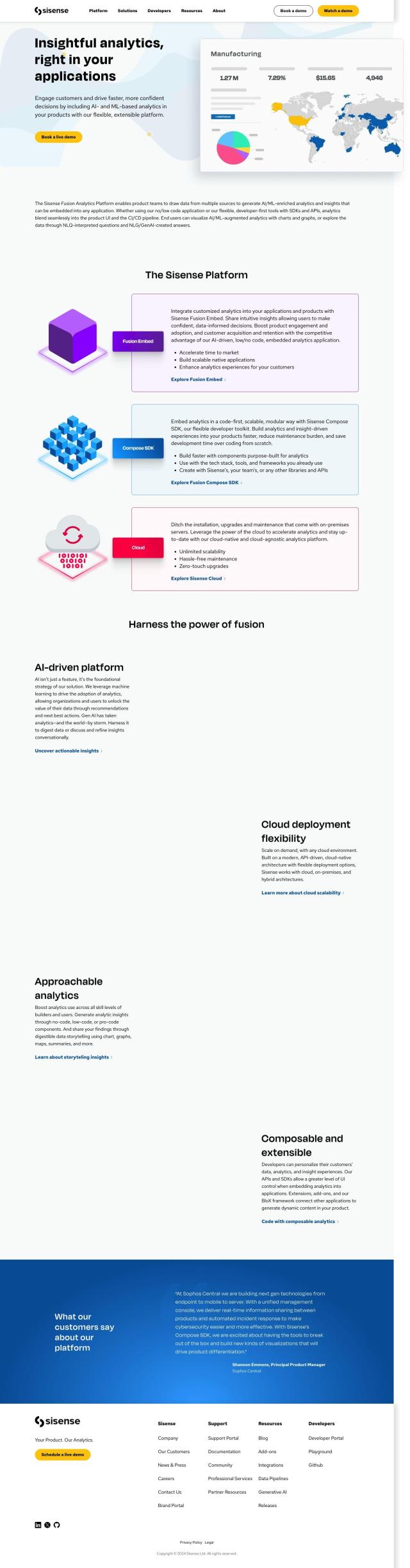
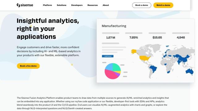
Sisense screenshot thumbnail

Sisense

If you need a highly customizable and scalable option, check out Sisense. This analytics tool offers end-users interactive, personalized insights and can connect to data sources with ease. With pro-code, low-code and no-code abilities, Sisense can meet a broad range of analytics needs, letting you create custom dashboards and share insights through different channels.
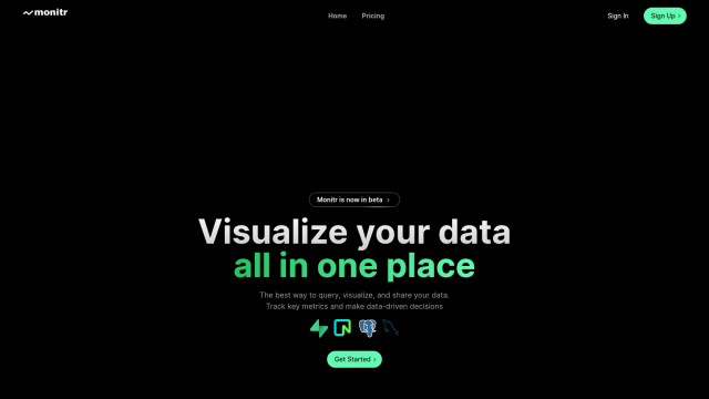
Monitr screenshot thumbnail

Monitr

Last, Monitr offers a single view of data across multiple sources so you can query, visualize and share data. It connects to data sources like Supabase, Postgresql and MySQL, and offers collaborative SQL querying and AI-infused analytics tools. Monitr's free plan is a good way to get started and see what it can do before you sign up for a paid plan.

Additional AI Projects

Canvas screenshot thumbnail

Canvas

Link, query, and visualize data from 150+ SaaS tools without coding, empowering non-technical teams to make data-informed decisions.

Polymer screenshot thumbnail

Polymer

Converts complex data into intuitive, actionable visualizations, linking multiple sources and generating real-time insights with AI-driven analytics and suggested trends.

Qlik screenshot thumbnail

Qlik

Unifies data from hundreds of sources into a single fabric, enabling customers to integrate, transform, analyze, and take action on their data for better decisions.

Domo screenshot thumbnail

Domo

Unifies data from any source, providing AI-driven insights and automation to drive real-time decisions and meaningful actions across the organization.

Airbook screenshot thumbnail

Airbook

Accelerate data analysis and insights generation across teams with native connectors to 150+ data sources, collaborative querying, and visualization tools.

datapine (RIB BI+) screenshot thumbnail

datapine (RIB BI+)

Empower data-driven decision-making with self-service analytics, combining data from multiple sources into a single, secure point of truth.

Mode screenshot thumbnail

Mode

Unify data analysis and visualization with SQL, R, Python, and interactive dashboards to accelerate insights and collaboration across teams.

GoodData screenshot thumbnail

GoodData

Quickly build custom data products with interactive analytics abilities, leveraging AI-powered features like a no-code interface and chat assistant for effortless insights.

Tabula screenshot thumbnail

Tabula

Automate data workflows, standardize disparate sources, and gain real-time insights without coding, empowering data-driven decision-making across departments.

Explo screenshot thumbnail

Explo

Embed interactive dashboards and self-serve reporting directly into products, enabling end-users to customize analytics experiences and make better decisions.

Tractorscope screenshot thumbnail

Tractorscope

Turn complex data into meaningful insights with customizable dashboards and charts.

Breadcrumb screenshot thumbnail

Breadcrumb

Transform data into interactive AI dashboards, connecting multiple sources, and track trends in real-time with 100% accurate visualizations and natural language queries.

Hex screenshot thumbnail

Hex

Unify data teams with AI-assisted exploration, collaboration, and interactive reporting, accelerating data work and improving accuracy in a single, modular workspace.

Luzmo screenshot thumbnail

Luzmo

Add interactive, AI-powered dashboards to SaaS products in weeks, providing real-time insights and self-service analytics for customers.

Vizzly screenshot thumbnail

Vizzly

Build and share interactive, customizable analytics experiences with a no-code dashboard builder, empowering users to explore data without technical hassle.

Graphy screenshot thumbnail

Graphy

Combine data from multiple sources into interactive, shareable reports in minutes, with AI-powered tools reducing creation time by 80%.

Hurree screenshot thumbnail

Hurree

Get instant insights without being a data expert, with one-click connections, centralized visualization, and AI-powered analysis transforming hours into clicks.

Zing Data screenshot thumbnail

Zing Data

Get answers to data questions in seconds, without expertise, using intuitive natural language querying and automated data modeling.

Streamlit screenshot thumbnail

Streamlit

Build interactive data apps with a few lines of code, and deploy instantly with a single click, without needing front-end programming expertise.

Embeddable screenshot thumbnail

Embeddable

Craft compelling customer-facing analytics experiences and embed them directly into your application, with full control and flexibility, in a fraction of the time.