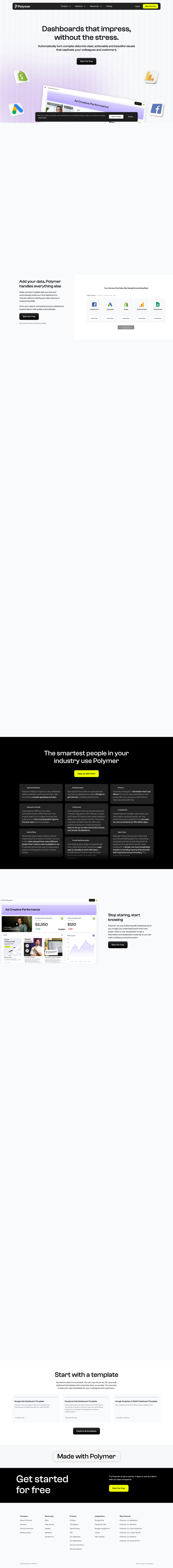
Chartonomics is an application that converts any data into a variety of charts and other visualizations with a click. There's no need to set up the data beforehand, so you can just throw in a jumble of ideas or data and get a visualization in more than 20 chart types.
Among Chartonomics' features:
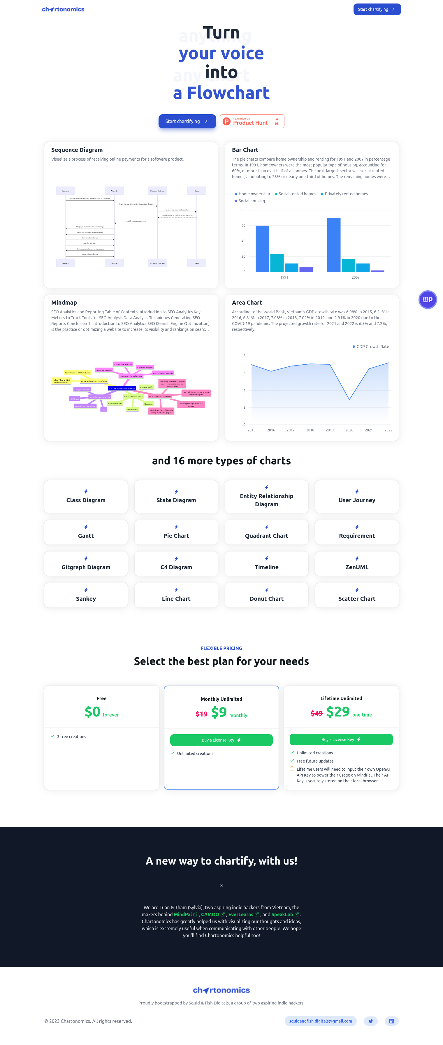
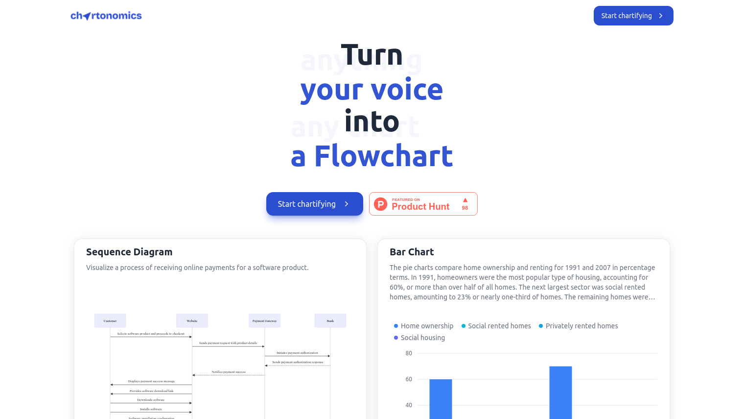
- Sequence Diagram: Show how something like receiving an online payment for a software product works.
- Bar Chart: Compare data in percentage terms, for example, home ownership vs. renting.
- Mindmap: Structure and visualize complex information like SEO analytics and reporting.
- Area Chart: Show data like GDP growth rates over time.
- Class Diagram, State Diagram, Entity Relationship Diagram, User Journey, Gantt, Pie Chart, Quadrant Chart, Requirement, Gitgraph Diagram, C4 Diagram, Timeline, ZenUML, Sankey, Line Chart, Donut Chart, and Scatter Chart: A wide variety of chart options for different purposes.
Chartonomics has a few pricing tiers to accommodate different customers:
- Free: $0, good for forever, with 3 free creations.
- Monthly Unlimited: $19 per month, with unlimited creations.
- Lifetime Unlimited: $49 one-time payment, with unlimited creations, free future updates and permanent access. Customers who buy the Lifetime Unlimited plan must enter their own OpenAI API Key, which is stored locally on their browser.
Chartonomics is good for quick visualizations, which is why it's good for communicating complex ideas. Its simplicity and variety of charts make it useful for business, education and other situations.
Published on June 9, 2024
Related Questions
I need a tool that can quickly turn my data into different types of charts and visualizations, what options do I have? Can you recommend a platform that allows me to create a variety of charts, such as bar charts, mind maps, and sequence diagrams, without requiring data setup? I'm looking for a solution that can help me communicate complex ideas in a simple and visual way, do you know of any tools that can do that? Is there an application that offers a range of chart types, including area charts, pie charts, and scatter charts, and can help me create them easily?
Tool Suggestions
Analyzing Chartonomics...